Across devices, platforms, and demographics, users consistently turn to images as their first point of interaction on a product page. Before reading a product title, scanning a description, or even checking the price, users instinctively engage with the image gallery.
This behavior is neither accidental nor superficial. It reflects a core truth of online shopping: users must make decisions without the benefit of physical inspection. In this context, product images become the bridge between uncertainty and confidence. A sparse visual presentation – especially one with just a single image – is no longer sufficient to compete in the high-stakes world of digital retail.
At a minimum, every product page should include at least three high-quality images, but in practice, that number should often be higher. These images fulfill a crucial role in building trust, communicating product attributes, and nudging users toward conversion.
The Psychology of Visual Decision-Making in E-Commerce
Human perception is overwhelmingly visual. Neuroscience research shows that people form first impressions within 50 milliseconds, and 90% of the information transmitted to the brain is visual. This quick decision-making process helps explain why product images have such a powerful impact on how users behave when shopping online.
When a visitor lands on a product page, they’re essentially trying to answer a single question: “Can I trust this item to meet my needs?” In the absence of tactile feedback, buyers rely on visual details instead of physical touch. They’re looking to understand texture, size, functionality, and context. Not just how something looks, but how it feels, how it works, and how it fits into their life.
Insufficient quantity of images undermines this decision-making process. A single front-facing product photo tells only a fraction of the story. Users want to see the product from multiple angles, in different contexts, and ideally, in use by real people. Without that, they may quickly disengage, seek reassurance elsewhere (such as reviews or Q&A), or abandon the purchase altogether.
In UX testing across multiple device types, nearly half of users begin interacting with product images as their first action upon arrival on a product page. This means images are the starting point for decision-making. If that experience fails, the entire purchase journey is at risk.
What Happens When There Are Too Few Images?
When users encounter a product page with only one or two images, hesitation sets in almost immediately. Instead of building confidence, these sparse visuals raise questions: What’s missing? What does the other side look like? How big is it, really? The result is a subtle yet powerful erosion of trust.
This effect is consistent across product categories and price points. Whether shopping for a $10 cosmetic item or a $2,000 laptop, users expect a minimum level of visual detail. The absence of that detail makes the product feel incomplete, or worse, untrustworthy. Even simple products benefit from varied perspectives. A toothbrush shown in packaging, in hand, and on the counter tells a far more compelling story than a single isolated image ever could.
In usability testing, users routinely expressed disbelief or frustration when shown products with only one image. Some explicitly stated they would never buy such items, not because of the product itself, but because the limited imagery signaled a lack of care or credibility from the brand.
From a behavioral standpoint, this reaction is entirely rational. With no way to physically inspect the product, users interpret limited visuals as a sign that something is being hidden. And in the absence of trust, users are more likely to bounce, return to search results, or switch to a competitor with richer visuals.
Why “3 Images” Is the Baseline, Not the Goal
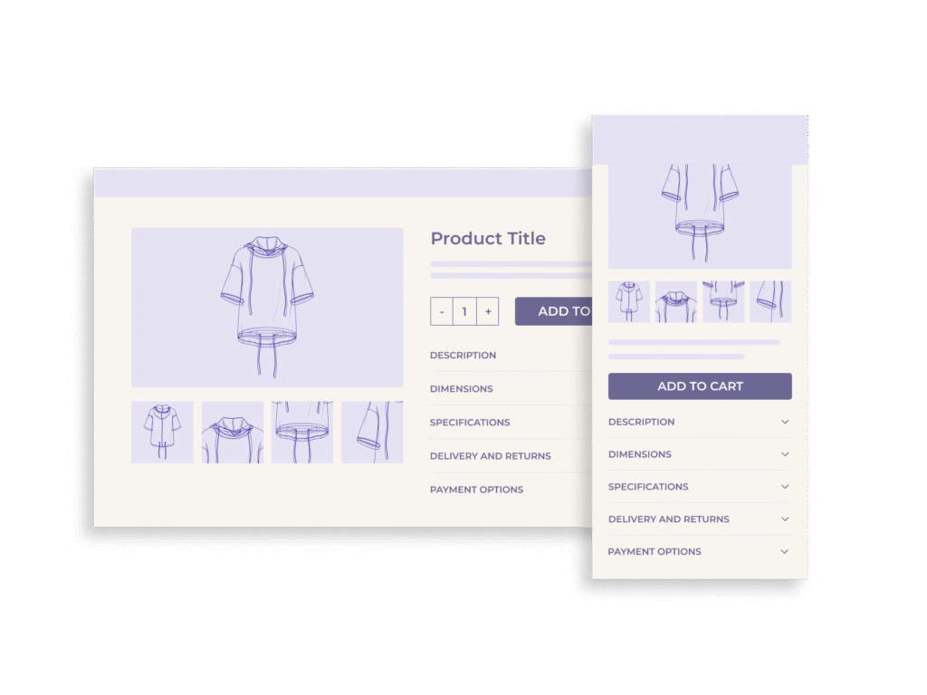
Establishing a minimum of three product images is a practical UX safeguard. It’s the bare threshold required to form a basic visual understanding of an item, particularly when users can’t rely on tactile or physical inspection. But in most cases, three images only begin to cover what users truly want to see.
At minimum, every product page should include these three image types:
- Default Image – A clear, front-facing photo of the product.
- Alternative Angle – A secondary perspective to give dimensional context.
- In-Context or Scale Image – Showing the product next to a familiar object or in a real-life environment to help users understand size and use.
However, optimal product galleries go much further. The most effective image sets typically include:
- Detail Shots – Zoomed-in views of texture, stitching, or intricate components.
- Lifestyle Images – Showing the product in use, often by a person, to communicate function and aspirational value.
- 360° Views or Rotational Images – Especially useful for complex or design-centric products.
- Accessories or What’s Included – Clearly showing cables, parts, cases, or bundled items.
- Model Photography – For apparel, cosmetics, or wearable tech, seeing the product on a person significantly improves decision confidence.
Each of these visual formats plays a specific role in giving users a clearer and more complete understanding of the product. While three images are enough to prevent immediate dropout, providing 7-10 well-chosen images is what actually drives conversion. Users don’t complain about too many visuals, but they will quickly leave when there are too few.
Importantly, this approach applies across product types. Whether selling furniture, headphones, jackets, or notebooks, users need a multidimensional visual experience to feel confident. And if you’re selling high-consideration items (electronics, home goods, luxury products), robust imagery is essential to compete.
Case Study: Creating Angles from a Single Packshot
In an ideal scenario, product teams have access to a full suite of professionally shot images: multiple angles, lifestyle setups, close-ups, and scale references. But in reality, constraints often make this impossible, especially when dealing with supplier-provided assets or legacy products. So what happens when you only have one image to work with?
In one client project, we faced exactly that situation: a single static packshot of a product. At first glance, it seemed insufficient to build an engaging product page experience. But instead of settling for a barebones gallery, we used design creativity to extract more value from that lone image. See the full case study here.
The strategy involved creatively cropping, repositioning, and compositing the original packshot into multiple derived visuals. We produced mock “alternate angles” by adjusting scale and adding benefits. We even created “hero” shots and lifestyle-inspired scenes that gave users a better sense of the product’s purpose and aesthetic.
While not a substitute for a full professional shoot, this approach allowed us to mimic the perception of a multi-image experience. The result: bounce rates decreased, users spent more time in the gallery, and the client was able to defer a costly reshoot while still delivering a visually persuasive page.
This case demonstrates a key principle: quality and quantity of images matter, but so does inventiveness. When budgets or logistics are tight, UX teams can still elevate product perception through intelligent visual design even when starting from a single asset.
UX Recommendations for Product Image Galleries
While adding more images is essential, the way those images are presented is equally critical. Poor gallery UX can negate the benefits of even the best product photography.
Here are key UX recommendations to maximize the impact of your image gallery:
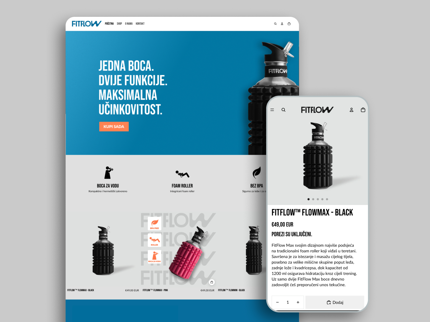
1. Image Order Matters
Lead with your strongest, clearest image, typically a front-facing, unobstructed view of the product. Follow with contextual shots, alternative angles, and close-ups. End with lifestyle or accessory visuals. This sequence mirrors how users naturally build mental models: from identification to exploration to envisioning use.
2. Enable Easy Navigation
On both desktop and mobile, the gallery should be swipeable, tap-friendly, and responsive. Thumbnails or indicators should be visible to signal how many images are available. Avoid placing images behind secondary clicks or tabs. Make them immediately accessible.
3. Prioritize Zoom and Resolution
High-resolution images should support zoom functionality, ideally on hover (desktop) or pinch (mobile). If users can’t zoom in on texture, materials, or small details, they lose a vital layer of information that often influences their decision.
4. Avoid Image Clutter
More images don’t mean better UX if they’re repetitive or low quality. Each photo should add new information. Showing five slightly different angles of the same front view only increases cognitive load without improving clarity.
5. Design for Mobile First
On mobile, users often rely more heavily on visuals due to limited space for text. Ensure that galleries are swipeable with a single finger, load quickly, and allow full-screen viewing. Avoid gallery designs that rely on hover states or small tap targets.
6. Support Mixed Media
If available, support supplementary media such as product videos, 360-degree viewers, or animated transitions. These should be part of the main gallery, not hidden separately, and clearly marked so users know they’re interactive.
Alternatives and Enhancements: Beyond Static Images
While high-quality product images form the backbone of a strong product page, dynamic visual content and user-supplied media can push performance even further. These enhancements don’t replace static photos. They supplement them by giving users richer, more engaging perspectives on the product.
360-Degree Views
Rotational imagery allows users to spin a product and inspect it from every angle. This is especially effective for products with complex forms such as shoes, furniture, or electronics, where dimensional understanding is key. A 360-view mimics the in-store experience more closely than flat photos ever could.
However, implementing 360-degree features requires a strong backend and thoughtful UI. Loading speeds must remain fast, mobile gestures must be intuitive, and fallback options must exist for browsers or devices that don’t support the interaction.
Product Videos
Video allows you to demonstrate not just how a product looks, but how it behaves. For apparel, cosmetics, tools, or gear, this medium communicates fit, function, and emotion – all within seconds. Even a 10–15 second clip can drastically improve engagement and conversion rates.
Best practice: embed videos within the primary gallery, not in a separate tab. This maintains the continuity of the visual experience and ensures higher view rates.
User-Generated Photos
Customer photos provide authenticity that polished marketing shots can’t always deliver. Seeing a product in the hands (or homes) of real people builds trust, especially for high-touch categories like home décor, clothing, and accessories.
You can surface these images from reviews, social media, or direct uploads, but be sure they meet a basic visual standard. Grainy or poorly lit images may hurt more than help. Moderate and curate user-submitted content to keep quality consistent with your brand.
AR and Try-On Features (Where Appropriate)
Augmented reality is still an emerging enhancement, but it’s proving highly effective for furniture, glasses, makeup, and even footwear. While it requires more technical investment, it significantly narrows the imagination gap for users deciding on visual fit.
Implementation Prioritization: Where to Start When Resources Are Limited
Not every business has the capacity to produce a full set of high-quality images for every product. Budget, logistics, or supplier constraints can limit what’s possible, especially for large catalogs or fast-moving inventories. That’s why prioritization is critical.
1. Focus on Best-Sellers First
Start with your highest-converting or most-viewed products. These are already drawing user interest, so improving their imagery can deliver immediate ROI in terms of reduced bounce rates and higher conversion. A few additional images for a top seller often outperform adding basic images to dozens of low-traffic SKUs.
2. Optimize Key Product Categories
Concentrate your efforts on verticals where visuals matter most: apparel, cosmetics, home furnishings, accessories, tools, and electronics. In these categories, users rely more heavily on images to evaluate texture, fit, context, and use.
3. Use User-Generated Content to Fill Gaps
If manufacturer images are sparse, leverage content from your own customers. Invite them to upload photos in reviews or link their social media posts. This not only fills visual gaps but also boosts trust and engagement.
4. Batch and Template Photo Shoots
To streamline production, create repeatable photo setups or use templated backgrounds. For example, shoot multiple products of the same category in one session with consistent lighting, angles, and props. This speeds up workflow while maintaining brand consistency.
5. Track and Measure Impact
Use A/B testing or analytics to track how enhanced image sets affect performance. Monitor changes in conversion rate, time on page, and scroll depth. This data will help justify future investments in visual content and guide further prioritization.
Conclusion
Shoppers can’t touch, hold, or try products, so they rely on visuals to bridge the gap between curiosity and commitment. The moment a user lands on a product page, the image gallery becomes the anchor point for engagement. If it’s weak, the rest of the page won’t get a chance to work.
Providing at least three high-quality product images should be considered the minimum standard.. But to truly build confidence and drive conversions, brands must go further: multiple angles, contextual images, lifestyle scenes, close-ups, and where possible, rich media like 360-views or product videos.
And when limitations arise (as they often do) creativity, prioritization, and strategic use of user-generated content can still deliver results. The goal is not just to show the product, but to make users feel they understand it as well as if they were holding it in their hands.