In many direct‑to‑consumer (DTC) websites, users often arrive through search engines, social media links, or cross‑site referrals without following the main navigation path from the top. In those situations, traditional orientation aids like breadcrumbs may be absent, incomplete, or ignored. As a result, users struggle to understand where they are in the site’s structure.
Highlighting the current scope (e.g., the active top‑level or mid‑level category) directly in the main navigation helps re‑establish context immediately, allowing users to orient themselves quickly, decide where to go next, and continue exploring the site with confidence. This small visual cue can significantly improve usability, lower cognitive load, and reduce frustration, leading to better user engagement and higher conversion potential.
The Cognitive Importance of “Knowing Where You Are”
Human spatial cognition underlies web navigation
Humans are wired to make sense of spatial environments. Our brain’s spatial‑cognition abilities (the capacity to understand our position in space, judge directions, and retain spatial memory) help us navigate physical environments.
Although a website is not a physical place, navigating it still engages many of the same cognitive mechanisms. To orient themselves and plan their next steps, users mentally build a “map” of the site’s structure: its main sections, subsections, and content categories. When this mental map is supported by clear cues (e.g., navigation labels, active states, consistent structure), navigation becomes more intuitive and efficient. When those cues are missing or confusing, users may experience disorientation or “navigation anxiety.”
Cognitive load and wayfinding
When people land on a new website, they often don’t know how it’s organized. They have to remember how they got there, figure out what page they’re on, and decide where to go next. All of this uses brainpower.
Cognitive load theory says that the more effort it takes to process information, the harder it becomes to make good decisions.
If the navigation doesn’t clearly show the current section, users have to guess. They might scan every menu item or try to remember earlier steps, which can feel confusing or tiring.
But when the current category is clearly highlighted in the menu, users don’t have to think as hard. It’s like showing them a marker on a map: “You are here.” This makes it easier to browse and find what they need.
Why Breadcrumbs Alone Aren’t Enough
Breadcrumbs are helpful for showing users where they are in a website’s structure. But in real-world use, many people either don’t notice them or don’t rely on them consistently. In usability testing, users often overlook breadcrumbs, especially on mobile or when they’re scanning quickly.
Even when breadcrumbs are present, they aren’t always helpful. Some show vague category paths (“Home > Women > Clothing”) that don’t reflect the product’s actual context. Others get hidden in sticky headers or are visually too small to notice.
Let’s say someone clicks a paid ad for a “minimalist wool coat” and lands directly on a product page. If they want to see similar coats, but breadcrumbs are missing or unclear, they’re forced to guess which category, “Outerwear,” “Jackets,” or “New Arrivals”, to try next.
This slows the user down and increases cognitive load. When people have to stop and figure out where they are, it interrupts their flow and makes the experience feel harder than it should.
To reduce this friction, we need a stronger, more visible cue: the main navigation.
Main Navigation as an Orientation Anchor
Main navigation is one of the first places users look to understand how a site is organized. It sits at the top of every page, and users often glance at it for context, especially when they arrive mid-journey from a search engine, ad, or referral.
Highlighting the current category or section in the main navigation gives users an instant sense of place. It tells them, “You’re here.” This visual cue acts like a street sign in a busy city: clear, simple, and easy to trust.
For example, imagine a user visits a DTC skincare brand and lands on a page for a vitamin C serum. If “Skincare” is visibly highlighted in the main menu (maybe in bold, underlined, or with a background tint), the user immediately knows they’re viewing a product in that category. They don’t have to guess. They’re more likely to click back to “Skincare” and browse related products.
This small design change supports spatial cognition – the brain’s ability to make sense of where things are. It also reduces cognitive load because users don’t need to think hard to figure out where they are or how to move forward.
Good navigation design isn’t just about helping users move; it’s about helping them understand. And when users feel confident about where they are, they’re more likely to explore, stay longer, and convert.
Scope Highlighting – Best Practices
Highlighting the current scope in your main navigation doesn’t need to be flashy but it must be clear, consistent, and easy to notice.
Use strong visual contrast
Make sure the active menu item stands out. You can:
- use a different background color (like a soft highlight),
- add a bold underline or border,
- change the font weight or color.
What matters most is that the active category looks different from the others and that this difference is easy to spot, even at a glance.
Apply it to meaningful levels
Highlight the most helpful category, not just the top-level one. For example, “Women’s” might be too broad. Highlighting “Dresses” or “Outerwear” gives users better context and helps them explore nearby products.
Keep it visible on all pages
Whether a user lands on a product, article, or special campaign page, the main navigation should still show where they are. Even if the navigation item is part of a dropdown, show its selected state when the menu is open.
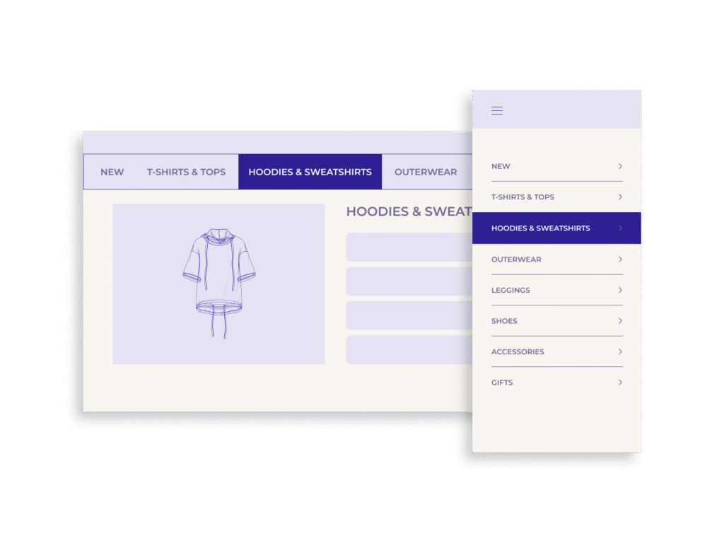
Make it work on mobile
Mobile navigations often use hamburger menus or tab bars. When the menu is opened, highlight the current category using the same styles as on desktop (bold, background color, or underline) and keep it accessible for touch and screen readers.
Real-World DTC Examples from Different Verticals
Fashion
A shopper lands on a product page for a linen jumpsuit. If the “Clothing” category is highlighted in the top menu, they can instantly click to explore other garments. But if no category is marked, they’re left guessing and might exit instead of browsing further.
Skincare & Beauty
A customer clicks on a retinol serum from an ad. When they arrive, the navigation shows that they’re under “Skincare > Serums.” This helps them find similar products quickly, instead of navigating through unrelated sections like “Best Sellers” or “New In.”
Furniture & Home Goods
Imagine browsing a modern DTC home brand. A user lands on a product page for a bedside lamp. If “Lighting” is highlighted in the menu, they can explore more lamps without searching again. Without scope highlighting, they might not realize where they are within the site’s structure.
Supplements or Wellness
A user clicks on a targeted landing page for “Sleep Support.” Highlighting the category “Wellness > Sleep” in the navigation gives clarity. Without it, users may wonder: is this part of “All Products,” “Bundles,” or “Lifestyle?”
In every case, highlighting scope reduces guesswork and builds confidence, especially when users enter through side doors, not the homepage.
Mobile Navigation Considerations
Designing for mobile navigation adds extra complexity. Limited screen space, hidden menus, and gestures can all affect how users find their way around. But the need to show the current scope is just as important on mobile, if not more.
Keep active categories visible when menus are open
Most mobile sites use a hamburger menu to house their main navigation. When the menu is opened, make sure the user’s current category is clearly marked. For example, “Skincare” should be bolded or underlined if the user is on a product in that section.
Use touch-friendly styling
Any highlight or visual indicator should be large enough to tap and easily visible, even in bright light. Avoid subtle changes like light gray text or thin underlines that can be missed on small screens.
Consider sticky tabs or subnavigation
If your site uses sticky navbars or tabs (common for DTC brands), make sure the active tab remains visibly selected. This helps users move across categories without reopening the full menu.
Test for scroll and modal interactions
Sometimes mobile menus or category selectors disappear when users scroll or open modals. Ensure the active category stays highlighted or reappears when users navigate back so they don’t lose context.
Mobile design must work harder to make orientation obvious in tight spaces. A well-highlighted scope can prevent frustration and keep users moving smoothly.
Accessibility & Inclusivity Factors
Navigation design must work for everyone. Scope highlighting should be implemented in a way that’s accessible to people using screen readers, keyboards, or assistive devices.
Use semantic HTML and ARIA roles
Make sure navigation elements use correct tags (<nav>, <ul>, <li>, <a>) and add ARIA roles like aria-current=”page” to highlight the user’s current location. This lets screen readers announce, for example, “You are on the Skincare page.”
Ensure strong color contrast
Design highlights with high enough contrast to meet WCAG 2.1 AA standards. For instance, if a background color indicates the active state, the text over it must still be easy to read. Avoid low-contrast shades like pale gray on white.
Don’t rely on color alone
Use multiple cues such as color and font weight, or underline, to indicate the active category. This helps colorblind users and others who may not perceive subtle changes.
Keyboard navigation
Ensure users can tab through your menu and that the current scope is visually and programmatically clear as they move. Keyboard users should get the same feedback as those using a mouse or a tap.
Inclusivity in navigation improves UX for everyone. When the current location is communicated clearly, all users benefit from faster decisions and fewer dead ends.
Conclusion
When users land deep in your site from search, ads, or social, they need quick visual cues to feel grounded.
Breadcrumbs help, but they’re often missed. Highlighting the current scope in your main navigation is a stronger, more reliable way to orient users. It reduces cognitive load, supports wayfinding, and builds confidence. That confidence leads to better browsing, longer sessions, and more conversions.
The takeaway:
Don’t make users work to find out where they are. Show them.
Highlight the current category or section in your main navigation on every page, across all devices, and give your users a clear path forward.