
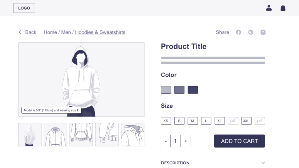
For online shoppers, product images act as stand-ins for physical interaction, enabling critical assessments of shape, color, material, and construction. Among the foundational image types, “cut-out” images (which isolate the product against a neutral background) and “angle” images (which show it from multiple viewpoints) serve as the core visual tools that help users fully understand what they’re considering.
Many e-commerce sites fail to provide these essential images for every visually distinct product variation. Whether due to production overhead or oversight, the absence of consistent visual representation (especially across color and material variants) undermines user trust, complicates decision-making, and ultimately depresses conversions.
E-commerce managers must prioritize unique cut-out and angle images for every meaningful visual variant. Doing so not only meets user expectations but also directly supports business outcomes, from reduced returns to enhanced brand credibility.
The Psychology of Visual Certainty
When users explore a product online, they are constructing a mental model of the product to compensate for the inability to interact with it physically. This cognitive process relies heavily on visual input. Cut-out and angle images serve as the primary building blocks of that model, enabling users to grasp the object’s shape, texture, and detailing.
When images are missing (particularly for the user’s preferred variation), the psychological experience shifts from certainty to speculation. Users begin to fill in the gaps themselves, guessing whether the navy version of a sofa has the same texture as the tan, or whether the back of the green backpack includes the same zipper as the red. This mental strain, however subtle, diminishes confidence. As studies in behavioral economics and user experience research have shown, even small moments of doubt can impact purchase intent.
Moreover, incomplete product imagery introduces a sense of operational sloppiness. When certain variations are depicted comprehensively while others lack even basic cut-out views, users may assume the site hasn’t invested adequately in its infrastructure or overall product management. In usability testing, some users explicitly questioned whether missing images were due to resource constraints – a red flag that triggers doubts about reliability, product quality, and post-purchase support.
UX Pitfalls of Incomplete Visual Variation Coverage
The absence of complete cut-out and angle images across all visual variations disrupts critical user tasks and introduces measurable friction throughout the purchase funnel.
Forced Guesswork Undermines Decision Confidence
When users are shown a default variation (e.g., red shoes) with full image coverage but their preferred variation (e.g., blue shoes) lacks corresponding angles, they are forced to mentally fill in the gaps. This guesswork imposes cognitive load and frequently leads to decision paralysis. As observed in extensive usability testing, users often scroll, refresh, and click through dropdown menus in vain attempts to confirm details visually, only to abandon the process when doubt outweighs certainty.
Inconsistent Visuals Imply Operational Neglect
Missing images in certain variations suggest an internal ranking of product importance as if only the default or most popular variants deserve full representation. This perceived imbalance undermines trust, especially among users who are underrepresented by those defaults (e.g., shoppers looking for niche colors, sustainable materials, or less common styles).
Higher Return Rates and Increased Customer Support Load
From a business standpoint, incomplete visual data translates into higher post-purchase dissatisfaction. A customer who couldn’t view the back of a gray backpack may discover a logo or strap configuration they dislike only after delivery, resulting in unnecessary returns and associated fulfillment costs. Worse, product pages with image discrepancies tend to generate more customer service inquiries, straining support operations with easily preventable questions.
Abandonment and Brand Leakage
In the absence of visual confirmation, many users will simply look elsewhere. According to consumer behavior research, 56% of online shoppers have abandoned a purchase due to insufficient product images (Salsify Consumer Research, 2023). Once off-site, the likelihood of recapture diminishes significantly, especially if competitors offer a more visually complete experience.
Best Practices: Unique Cut-Out and Angle Images for Every Visual Variant
To meet user expectations and reduce friction in the decision-making process, e-commerce teams should provide unique cut-out and angle images for every visually distinct product variant.
Define Visual Uniqueness at the Variation Level
Not all product attributes require visual differentiation. Users don’t need cut-out or angle images for size variations (e.g., a small vs. large t-shirt) when those differences are not perceptually distinct. However, any variation that affects the visual presentation (including color, material, pattern, finish, or styling detail) warrants its own dedicated image set.
For example:
- Color: A navy shoe should be shown from all angles just as the default white variant is.
- Material: Leather and canvas bags of the same shape may reflect light differently and suggest different quality perceptions. Both should be shown in their respective materials.
- Pattern or Finish: A wood-grain texture versus matte finish on furniture dramatically alters visual perception and must be represented uniquely.
- The guiding principle is simple: if a user could reasonably expect a visual difference, show it. Avoid asking users to infer.
Maintain Uniformity in Image Style and Order
Consistency across variants doesn’t stop at availability. All cut-out and angle images should:
- Be captured in the same lighting conditions and against the same neutral background.
- Follow a consistent order (e.g., front → side → back → top).
- Maintain identical zoom levels and framing to allow easy side-by-side comparison.
Such consistency helps users isolate what is changing (e.g., the color or texture) without being distracted by irrelevant variables like angle discrepancies or inconsistent cropping.
Captioning and Metadata for Clarity
In cases where images are visually similar across variants (e.g., two shades of gray), provide explicit captions or metadata tags to confirm what’s being shown. Captions like “Charcoal Gray – Side View” help anchor users’ understanding and avoid confusion.
Strategic Trade-Offs and Scalable Implementation
While the UX imperative for comprehensive variant imagery is clear, e-commerce managers often face operational barriers – tight budgets, limited studio time, and complex product catalogs. The challenge, then, is not whether to pursue visual completeness, but how to implement it pragmatically and at scale.
Prioritize Variants with High Visual or Commercial Impact
Not all products require the same depth of image investment. Brands can prioritize image production based on:
- Sales volume or revenue share per variant
- Visual differentiation from other variants
- High return rates or customer inquiry frequency
- Product category norms and user expectations
For example, if a certain material (e.g., suede vs. mesh) has historically driven more customer returns, prioritize creating full cut-out and angle coverage for that variant, even if it’s not the top seller.
Use Conditional Rendering and Smart Defaults
If some variants lack full image sets, e-commerce platforms can mitigate UX breakdowns by:
- Displaying only those variants with complete image coverage by default
- Using messaging (e.g., “Image shown: Navy Blue – Side View”) to clarify which variant is depicted
- Enabling users to toggle or swipe through views only when the full set is present, rather than offering broken galleries
This transparency ensures users aren’t misled by a mismatch between selected variant and displayed imagery.
Cross-Industry Applicability
The need for comprehensive cut-out and angle images is a universal UX principle applicable across all sectors of e-commerce. Whether you’re selling apparel or appliances, furniture or fitness equipment, the user’s need to visually confirm what they’re buying remains constant.
Fashion & Apparel
In fashion, color and material differences are central to user preference. A t-shirt in “slate gray” may photograph very differently from “graphite,” especially under studio lighting. Shoppers are also particularly sensitive to fit details that are only visible from certain angles – such as sleeve taper, side seams, or neckline construction. Brands that fail to show every color variant in sufficient detail risk a high volume of returns, particularly among first-time buyers who are still calibrating trust.
Consumer Electronics
For electronics, angle images often reveal critical usability elements such as the location of USB ports, speaker grills, or hinge mechanics. A silver laptop and its black counterpart may share specs, but their aesthetic appeal can vary drastically. Users making high-involvement purchases (e.g., $1,000+ electronics) demand precise visual confirmation before committing.
Furniture and Home Goods
With furniture, small differences in finish (like “weathered oak” versus “natural ash”) dramatically influence buying decisions. Lighting reflections, wood grain direction, and texture visibility vary by angle and must be shown accurately. In a category where physical showroom access is often limited, cut-out and angle images are the primary interface between shopper and product.
Health, Beauty, and Personal Care
Packaging and color nuances are central in this category. A face cream with gold foil accents signals luxury, while a variant with green botanical imagery signals sustainability. Users often perceive these visual cues as indicators of formulation differences, even when the product name is identical. Providing cut-out and angle views ensures clarity – and guards against the kind of misinterpretation that drives product returns or regulatory complaints.
Industrial and B2B Markets
Even in non-consumer verticals like B2B supplies, lab equipment, or hardware, buyers want clarity. A toggle switch with different housing colors may correspond to different voltage ratings or environments. For professionals making high-stakes purchases, visual documentation is synonymous with technical accuracy.
Conclusion & Implementation Checklist
Product imagery is the primary interface between the customer and the product. The practice of providing unique cut-out and angle images for every visually distinct product variation is no longer optional. It is a baseline requirement for delivering clarity, reducing friction, and building transactional trust.
- Users expect to see their preferred variation in full before purchasing.
- Incomplete imagery leads to higher abandonment, lower conversion, and increased return rates.
- Consistency in visual documentation signals operational competence and enhances brand credibility.
Implementation Checklist for E-commerce Managers
Image Strategy
- Audit your current product catalog to identify SKUs missing variation-specific cut-out and angle images.
- Define visual uniqueness by attributes: color, material, pattern, finish.
- Establish image style guidelines (lighting, background, order) for all product categories.
Production & Workflow
- Prioritize image production for top-selling, highly differentiated, or high-return items.
- Use batch photography, automated rendering, or 3D imaging tools to scale production.
- Ensure DAM or PIM systems are configured to associate images with specific variant SKUs.
Front-End Presentation
- Display only available variant images in product galleries.
- Use captions or tooltips to clarify which variation is shown when images overlap in appearance.
- Remove or clearly annotate imagery for discontinued variants.
Cross-Functional Alignment
- Collaborate with product, merchandising, and customer service teams to track variant-specific complaints or return patterns.
- Incorporate UX feedback loops into ongoing visual asset management.
- Review visual completeness as part of product launch QA processes.